Attract More Visits By Updating Your User Interface
When was the last time you really looked at your website? I’m not talking about just updating little bits of information on a page or adding a blog post (which you should be doing, hello). I’m talking about really looking at it like a prospective customer would. How is your website design compared to other similar companies? Is your site easy to navigate? Are the graphics vibrant and thought-provoking? Why is Pabst Blue Ribbon beer making a comeback? (Seriously, it’s good beer!) If you haven’t asked these questions, you are probably missing out on potential sales and a really good retro beer.
What can you do you ask? The first thing is to look at your navigation. You want to simplify your menu to quickly get visitors to the places your products and services are fast. So instead of having a separate menu item for every service and product you offer (this is a way too common mistake that clogs up menu bars), add them under a header like Services or Products. From there you can sort them by product and service types. Having a clean menu structure makes it easy for visitors to get where they want quickly and intuitively. There is a reason big companies use this format in their website design, it works. You also have to remember how important responsive website design is as well. Your potential customers may have their first experience on your website from their smartphone and having an easy to navigate menu is crucial on a small screen.
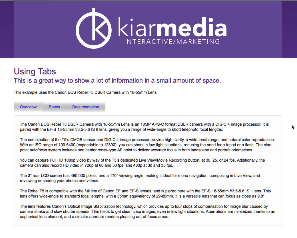
Once you have your navigation set, look at the layout of your home and interior pages as well. Are they cluttered with images and boxes of information all over the page? Too much information will turn off potential customers if they can’t find the important information right away. Using good high-quality images when ever possible is a sure-fire way tdraw the viewers eye right to what’s important. If you do have a lot of information, try using a tabbed info structure that can be easily toggled to show different information. Remember, your first tab should have a summary of why your product or service is special, then you can add additional tabs to drill down some of the more nerdy information.
Lastly, make it easy for your website visitors to contact you on all pages. A contact page with a short form is a necessity, especially when using a mobile device, but a phone number should be on the footer of all pages. Again remembering the mobile user, that number becomes a hot link that can be dialed by just clicking on the number. After all, you want people to call you right?
So crack that PBR, sit back and really look at your website design. It’s an investment you can’t afford not to make.
Kiar Media is a full service interactive advertising agency specializing in website design, search engine optimization (SEO) and social media. For more information on how Kiar Media can help your company grow its online presence, visit kiarmedia.com or call 920-403-0576.
About the author: Kiar Olson has been at the cutting edge of advertising, media, websites and interactive strategy since 1996. His love of 80’s hair bands and all things from that era make him well versed in being made fun of by his wife and two teenage children.


